ElyaDatabase ID Number: M165
Creator: Caden Dowd ’22 Computer Science
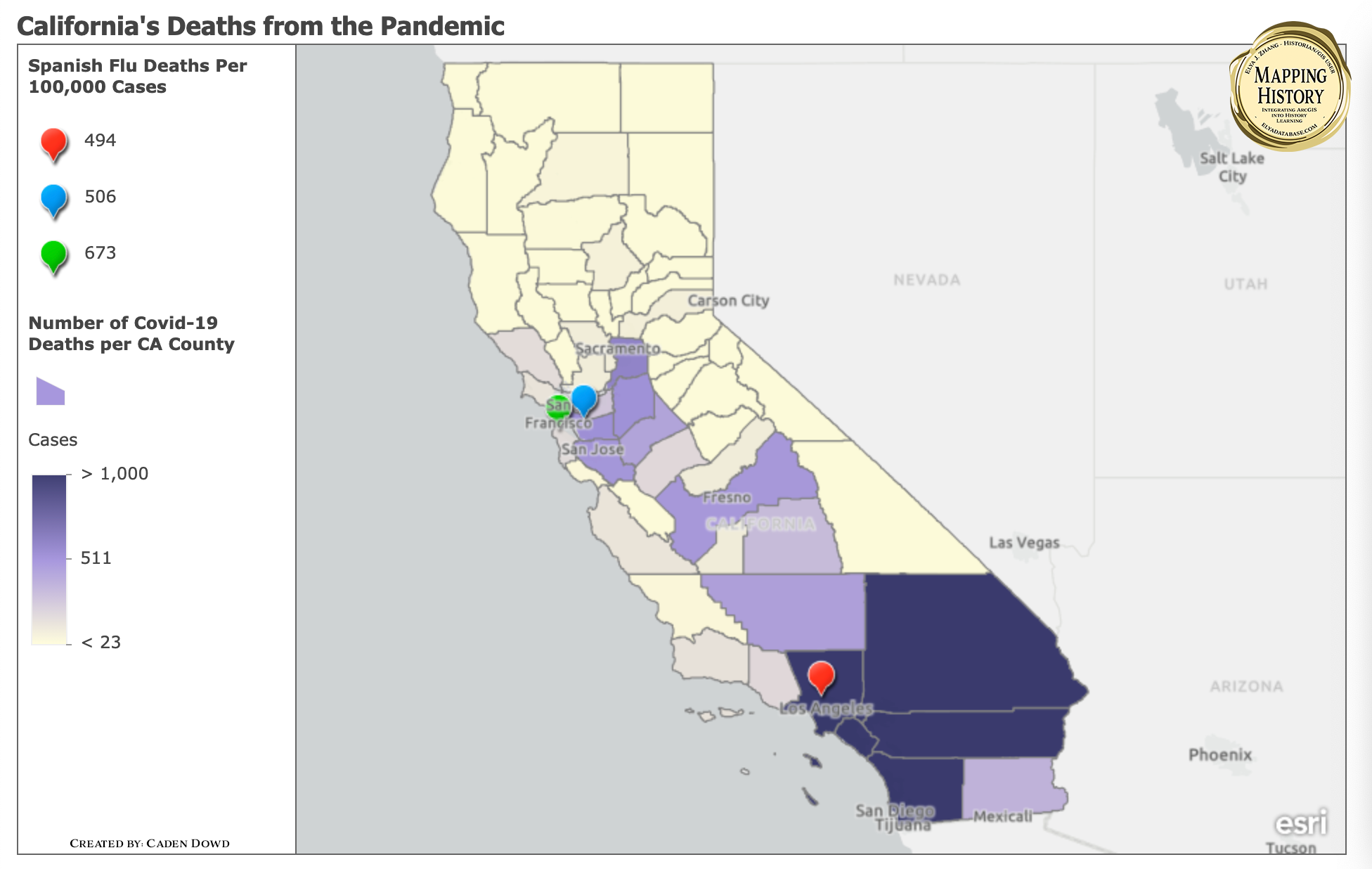
The map attempts to show both the Spanish flu and Covid-19’s effects in California during the pandemic. There was only data from the Spanish flu on death rates so that is what this map focuses on. There are individual points in the major cities that illustrate the number of deaths in the city per 100,000 infections. Next, the polygons are color coded to show the number of deaths per county due to Covid-19. Moreover, this map creates a good visual of how these respective cities have learned from past pandemics and each other. This paper examines how different cities handled both pandemics. Los Angeles had a relatively l ow death rate because of how they shut down schools, more masks, and quickly implemented self-isolation. On the contrary, Garcetti and LA county haven’t been as strict as they were in the past leading to some higher covid numbers. Likewise, there is growth in San Francisco who had an alarming death from the Spanish Flu because they ended their quarantine early and were hit hard with a second wave. Now the Bay Area has issued a strict two-week quarantine for anyone who l eaves the county for over 150 miles and returns.
Cite This Work :
Caden Dowd, “California's Deaths from the Pandemic.” Scale: 1:70,000. In Elya J. Zhang, ed., Mapping History Series. <https://elyadatabase.com/2022/06/11/californias-deaths-from-the-pandemic/> (accessed May 27, 2022).
Leave a Reply